martes, 27 de marzo de 2012

Cocha's Score: -3


After going to Cocha last Friday at Ripley, from Mall Plaza Vespucio, I could understand why people go there to plan their travels and do them, but I wouldn’t do it.

First of all, I get the feeling that all the experience was pretty old: You sat in front of a person that tries to smile, ask you where you want to go, how many days and since when and answers: “ok, here are the  options  we have for you, you can choose between package A, package B and… that’s it.” So first of all you’re buying a standardproduct that can’t be changed. At Cocha we ask for a tour in Cusco, and I wanted to go to all the ruins around the city, but that wasn’t in the plan, so I guess I would have to do it by myself anyway. One point less.

Also, they never tried to get me to feel excited about the trip, show me any pictures of the locations I was going to visit, tell me about places where to eat or go at night. They just explain me, very briefly, about the option we have chosen. For that experience I could just go to internet, search for the same tour, and let the page speakto me, with a robotic voice, about the tour. I mean, travel agency should really try to sell you their tour, be enthusiastic about it, tell me any other information that isn’t on the paper they gave us, they must transmit and share the joy of traveling with their customer. So that’s another point less.

And the location is really bad. Maybe the answer lies that they were part of Ripley and that was the location they gave them, but at least they could try to make the place look and feel better. If you look at the picture, you can see a plain and boring sight. It wasn’t comfortable either, they didn’t have a place to wait! If it wasn’t because they were right near the beds area of the store, we would have been waiting five minutes standing looking at fourpictures, one of them repeated in a smaller size. Having so many information about how to make people go into a buying mood they didn’t use it at all. So even before starting our service, I, at least, wasn’t very happy being there. That’s another big point less. 


And an issue that mixes the environment and customer service, the desk where you get your service wasn’t very good either. It was just a plain, simple and black desk, nothing more, nothing less. This also made us feel that we were buying any other physical product; we could be buying a mobile, a hammer in an old shop or even a pen. This made the interaction more difficult, colder, you never really feel comfortable sitting there. So I think they should really redesign that part, and everything else, so you can like of have a chat with the travel agency, more relaxed that finish with you buying the tour. 
That’s the third point against them.


But they should have something good, don’t they? And that’s that they have information fast. You ask about it and the person at the other side of the desk answer it right away. So you could know many things, fast, in one location, but only if you ask, as you can notice reading above. They never told us about travel insurance, of paying method, or how getting discounts there, we had to ask, but they answer. So here they won a point. So, after all this, they get a score of -3, very bad indeed. I understand that some people like all done, so they only pay and wait to enjoy the travel. But I think I could go to any travel agency, have the same talk we had last Friday, get all the details written down on a notebook, and then go home and do it all by myself, enjoy all theprocess of planning my trip to Cuzco, and spending less money. If someday I go and actually buy the tour and everything, they would have to have an interactive experience, where the travel agency has a tablet where (s)he shows you all the amazing things you’re going to do with them, sitting on a couch, drinking a cup of coffee or a soda, and enjoying the experience.


jueves, 15 de marzo de 2012

Trying to find another date for your fligh: Redesigning a part of LAN.com


I’ve used LAN.com a couple of times for domestic flights and every time the experience was good and easy. However, last Tuesday, due to the warm-up activity, my partner and I discovered that when the date you want to travel isn’t available, it can be troublesome to find another one near.
There were two reasons: (1) You might have to click several times to find the departure date first and also another several times to find your return date, if you were lucky. (2) When you click on: “Try another date”, it sent you back to the homepage to start all over again, making you guess the available date. The page shown on screen was like this one:

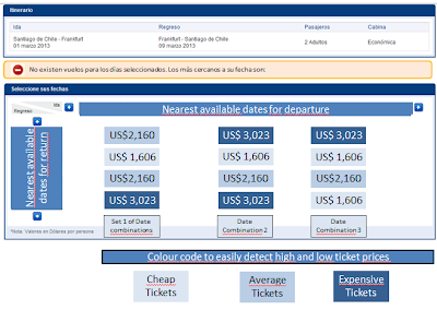
So, after watching how easy was for my partner to use the matrix of dates when the system worked, combined with the feedback of how the colours were useful to see clearly the expensive and inexpensive tickets later in the process, the solution just popped to my mind: Used the same kind of matrix combined with a colour code that shows the nearest dates available to travel. So this way they could use something they already have, only changing the colours a little bit.
The idea is something like this:

Where the distribution of the matrix is the same as the one already used. The columns are the nearest available dates for departure and the rows are the nearest dates for return, based on the ones you previously introduced.
The sets of colours might be different, but I think a good idea is to highlight the cheap ones with soft colours and the expensive ones with a darker. The prices in the middle, with a tone between the two extremes.
So in this way, finding the alternative dates for your travel should be far more easy than making several clicks trying to guess when is available the flight you want, or need, to take.

The good, the bad and the matrix: Redesigning a part of LAN.com


From the moment you decide you want, or need, to travel somewhere, to the moment you buy the tickets, can be a long way. There are many steps involved: choosing your destination, when to go, where to stay, what travel company I’ll use, what kind of tickets I’m going to buy and how much are they going to cost me. So it can be long and also not simple. Nevertheless, the arrival of internet has helped to make things a lot easier and a few clicks of distance, or that is what we supposed it should be. Sometimes… it’s not that easy.
And that’s what I found right away when I wanted to travel to Moscow with Lufthansa. I’ve bought tickets before, in LAN to be precise, and the homepage it’s very similar. But the first problem appears immediately when I tried to enter my destination. I couldn’t. The page gave me a couple of option and didn’t let me clicked on them easily. One would thought these kind of things shouldn’t happen in a big plane company, that everything would be easy, flawless, and no. So when I finally select my destination correctly, after I choose a wrong one, select a lot of things and couldn’t go on with the process, I arrived at the matrix with the dates of departure and return, with the prices, and didn’t understand the prices. Again, such a simple and elemental thing, done wrong. I didn’t know what currency was being used, till I read a paragraph up of the matrix. Also, it was one solid number, without thousands separator, that really difficult me the reading of the price. I mean, it’s really different read: 2934234,22 than $2.934.234,22. Imagine that showed 30 to 49 times on the page. Finally I never really read the whole price, as this was an exercise, but it would be a bigger problem if I have to buy those tickets.
Summarizing, it was not easy, not simple, not enjoyable, there were more problems later trying to understand the information showed, introduce the same information three or more times, etcetera, etcetera, etcetera. If I have to really buy a ticket in Lufthansa, I am going to think it twice. They need to improve a lot, really.
A complete different story was the one that I observed, and then told, from my partner when he tried to buy a ticket from LAN.com. He only had two problems: one very small, the other one not so much.
The first problem was that he couldn’t find the destination he was looking for. He tried Moscow first, and never appeared on the list, neither the message that the destination wasn’t available. The only message showed by the page was: “Inserte las 3 primeras letras de: País, Ciudad”. I thought: “Well, saying that you don’t have something can be bad for business, but it saves the client time and a possible bad impression, that could be worst”. That thing can be easily solved saying that the company doesn’t have that destination so far.
The other problem, that was the one I finally decided to redesign the page, was that when there weren’t flights available for the dates and destination selected, you get something like this on the screen:


And it wasn’t effective at all. After a couple of minutes he didn’t find another available date. When he clicked on “intente otra fecha”, the page sent him back to the homepage to start all over again. Clicking on “Día anterior” or “Día siguiente” also didn’t lead him to a solution. He didn’t click one or two times at those buttons, but 10 or maybe 20. Finally he decided to travel on another date, like two month before, and everything went smoothly and flawless. The matrix showing the prices was way easier to understand. The page also used colours to show and clearly differentiate prices. The words and number were big and easy to understand. It was far better that Lufthansa’s page.
So then, after finishing the observations, I thought that the matrix of LAN was very good, and it could be used to show, automatically, the nearest dates of departure and destination. First those that are before the dates entered and then those ones after that dates. They don’t need to do anything new, just use that good designed tool and put a couple of people to find a way to find the closest flights available. Fast and easy.
After this experience, I learned that many simple things can make an experience less grateful, like don’t having thousand separators. Also, I now appreciate more the time and effort that some companies do to present their information clear and easy to understand; other companies should learn from LAN.com… like Lufthansa. I mean, the client is not fool and, if he want to, he can make the effort and understand information presented in a not so simple way. But the experience is going to be worst, and that’s bad for business.
Also, I learnt that the solution to our problems can be nearer that we think. Listening to my partner later saying that the matrix, and their colors, was easy to understand would have solved the second problem in a matter of seconds. Probably other problems aren’t going to be so simple to solved, and maybe this solution is not so simple to do as I think, but we should always look around us first when we have a problem. You don’t have to reinvent the wheel always.

miércoles, 14 de marzo de 2012

Welcome and Testing

Testing, testing. 1, 2, 3.
Hello?
Hello world?
Hello kitty?
Hello doggy?

Hello Jack-o-Lantern.
This is random message has the only purporse of welcoming you, my tasty reader, to my new, and, I hope, probably messy, blog. - Just like that sentence. I hope you don't freak out during the term and this turns into something positive, helping to finds ways to get my thinking out of the box.

Cheers!